Creating Tables
A table is a set of intersecting columns and rows showing data according to well-defined categories. The purpose of a table is to reveal relationships within the data.
Below are some guidelines on creating tables. The focus here is on organizing the content rather than the graphic design (colours, lines, spacing, etc.). These guidelines are for numerical data, but many of the same principles apply to tables containing text or text and numbers combined.
As with most kinds of communication, form follows function: how you organize the table depends on the purpose and meaning of the content.
The Big Picture
- Use a table when you need to present precise data to make your point. If a general trend is all that you need to show, use a line graph; to show broad comparisons in data that varies greatly, use a bar chart.
- Experiment with different categorizations to come up with the structure that best brings out the connections among the data points. Look for themes and patterns, and consider how these can be represented in a table’s two dimensions.
- Keep in mind your purpose as the writer: What point are you trying to make? What should the reader learn from the table?
Arranging Columns and Rows
Once you’ve decided on the categories, there are a few conventions to setting up the table:
- The points of comparison are placed in the column heads, and the items being compared are placed in the stub entries. For statistical cross-tabulations, the independent variables are the column heads, and the dependent variables are the stub entries.
- Put the columns in a logical order, such as left to right chronologically or in decreasing order of importance. Use alphabetical order if no other sequence emerges from the data.
- Group similar or related stub entries together; don’t list them randomly or even alphabetically if there’s a more meaningful way of arranging them. Consider grouping rows with subentries under stub entries.
- If you don’t group the stub entries, sort them so that the values in the most important column range from highest at the top to lowest at the bottom. The columns could also be sequenced with high to low values left to right—overall, the values will descend diagonally from top left to bottom right.
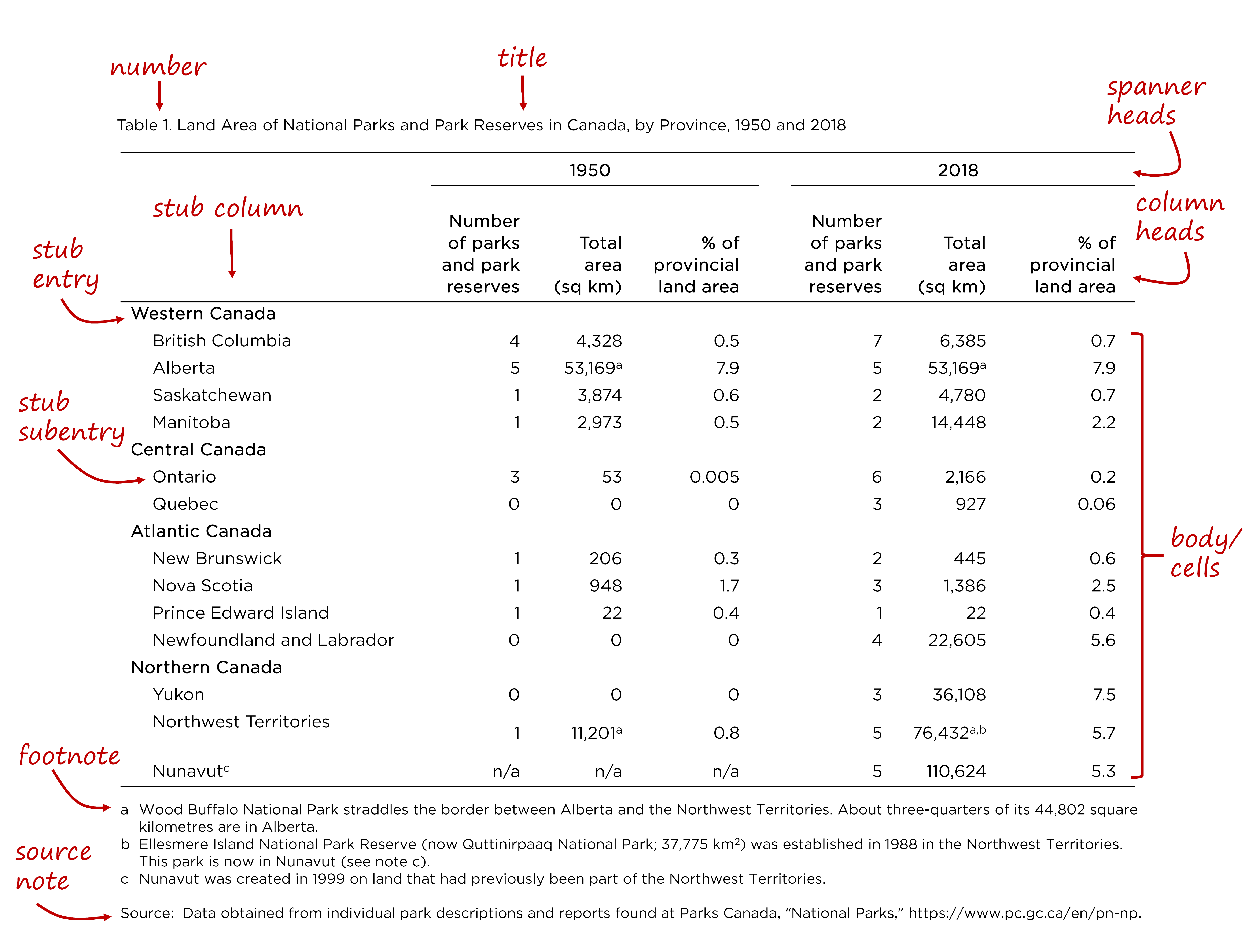
- There may be conventions that govern how tables are presented in your subject area. Look for examples from reputable, well-written sources to guide you. For instance, in the sample table above, the provinces are listed west to east, as is commonly done in geography.
The Data
- Include totals, averages, or percentages only if these are meaningful and useful to your purpose.
- Round off numbers to make them easy to read and compare, but not so much that their significance is lost.
- Keep the number of significant digits and decimal places consistent in each cell, except for occasional outlier values (as in the Ontario and Quebec rows in the table above).
- Use footnotes to briefly explain terminology, discrepancies, and special cases (for example, to note where data was drawn from an unusually small sample).
Title and Headings
- Number the tables if your document has more than one. Make sure the numbering corresponds to the order in which they are mentioned in the text.
- Give each table a title. It should precisely and concisely describe what the table shows. Don’t interpret the data in the title; do this in the main text or in a caption.
- Keep column headings and stub entries brief but descriptive.
- Use a spanner heading if you find that the same information is repeated in several column headings. This can also help in making the table more organized.
- Don’t use more than two spanner headings—too many layers of headings make the table harder to read.